We’ve seen the "Blue Marble" before. Most of us grew up with that iconic 1972 image burned into our collective memory. But the photos of Earth taken during the Artemis II mission hit different. They aren't just high-resolution updates of an old classic. They represent the first time in over fifty years that human eyes—not just robot lenses—have looked back at our home from the deep lunar vicinity. If you think you've seen enough satellite imagery to last a lifetime, these shots will make you reconsider.
The Artemis II crew didn't just snap a few selfies for Instagram. They captured Earth as a fragile, glowing marble suspended in a void so dark it makes your skin crawl. This mission marks a massive shift in how we perceive our place in the solar system. We aren't just orbiting anymore. We're leaving.
The gear that captured the Earth in ways we've never seen
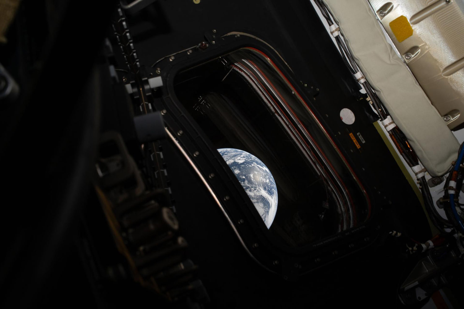
NASA didn't just hand the astronauts a standard off-the-shelf DSLR and hope for the best. To get these shots, the crew used highly modified camera systems designed to handle the extreme radiation and lighting conditions of deep space. When you're 230,000 miles away, the sun is blindingly bright and the shadows are absolute. There's no atmosphere to scatter the light. It's harsh.
The images show a level of atmospheric detail that puts previous missions to shame. You can see individual storm systems over the Pacific with such clarity that they look like textured brushstrokes. Honestly, the depth of field is what catches you off guard. Because the Orion spacecraft has such large windows compared to the old Apollo capsules, the perspective feels more immersive. You aren't looking through a peephole. You're looking through a panoramic portal.
Critics often argue that we could get better photos with unmanned probes. They're wrong. A probe follows a programmed sequence. An astronaut like Reid Wiseman or Victor Glover knows when the light hits the clouds just right. They have the "eye" for the shot. These photos carry a weight of human experience that a machine can't replicate. It's the difference between a security camera and a master photographer.
What those layers of blue actually tell us about our planet
When you look at the Artemis II photos, the first thing that strikes you is the thinness of the atmosphere. It looks like a coat of varnish on a wooden ball. It’s terrifyingly thin. This isn't just about "pretty colors." These images provide a visual baseline for Earth's current state as seen from the moon.
Scientists at NASA and the European Space Agency (ESA) use these high-altitude perspectives to track large-scale climate patterns that are harder to stitch together from low-earth orbit satellites. While the International Space Station (ISS) sits only about 250 miles up, Artemis II pushed out past the lunar far side. From that distance, you see the whole system at once.
- Atmospheric haze: The blue ring around the planet isn't uniform. It's a complex gradient of oxygen, nitrogen, and the particles we've pumped into it.
- Oceanic scale: The Pacific Ocean looks like an endless, deep void, reminding us that most of our "land" planet is actually a water world.
- The absence of borders: It's a cliché because it's true. You don't see lines between countries. You just see a biological island.
Why we can't stop staring at the lunar horizon shots
One of the most striking images from the collection shows the Earth "rising" over the lunar surface. We call it Earthrise, but it's technically a perspective trick caused by the spacecraft's orbit. The contrast between the dead, grey, cratered moon and the vibrant, wet Earth is jarring.
The lunar surface in these shots looks like crumpled tin foil or ancient ash. It's a graveyard of rock. Then, right above the horizon, there's Earth. It looks almost too bright to be real. This contrast is why Artemis II matters. It reminds us that while the moon is our next stepping stone, it's a hostile place. We're going there to learn how to survive, but the photos remind us why we want to come back.
Breaking down the Orion window tech
You might wonder why the photos look so crisp. It's not just the camera. It's the glass. The Orion capsule features advanced polycarbonate and glass layers designed to withstand the heat of reentry while remaining perfectly clear. Most people don't realize that standard glass would tint the photos or create massive glare from the interior lights.
The crew has to manage "light hygiene" inside the cabin to get these shots. They turn off every internal display and LED they can. They drape dark cloths over the windows to block reflections. It’s a low-tech solution to a high-tech problem. The result is a shot that looks like the spacecraft isn't even there. It's just you and the planet.
The psychological impact of the overview effect
Psychologists call it the Overview Effect. It's a cognitive shift reported by astronauts who see Earth from space. They describe a feeling of intense connection to the planet and a disappearance of political or religious conflicts. The Artemis II photos are the closest most of us will ever get to that feeling.
When you see these images, you realize how small our dramas are. Everything we've ever known—every war, every love story, every bit of history—is happening on that tiny blue speck. The clarity of the Artemis II mission brings this home better than the grainy Apollo footage ever could. It makes the abstract concept of "planetary health" feel personal.
How these photos compare to the Apollo 8 legacy
People love to compare Artemis to Apollo. It’s inevitable. But the Apollo 8 Earthrise photo was a surprise. The crew wasn't even supposed to be looking at the Earth; they were busy mapping lunar landing sites. They scrambled to find color film when they saw the planet peeking over the horizon.
Artemis II was different. This mission was designed with the image in mind. NASA knows that to keep the public invested in the "Moon to Mars" pipeline, we need to see what the astronauts see. These photos are sharper, the colors are more accurate, and the dynamic range is vastly superior. We aren't looking at a historical artifact anymore. We're looking at a live progress report of our species' expansion into the dark.
The technical hurdles of sending high res data back
Getting a 50-megapixel RAW file from the vicinity of the moon back to a server in Houston isn't as simple as hitting "upload." NASA uses the Deep Space Network (DSN), a series of massive radio antennas around the world. Bandwidth is limited.
During the mission, the crew had to prioritize which photos to send back first. They chose the ones that showed the Earth and Moon in the same frame. These "context shots" are the most valuable for public engagement. The rest of the high-resolution data is often stored on physical drives and downloaded once the capsule splashes down in the Pacific. That’s why we often see a "second wave" of even better photos a few days after the mission ends.
Stop looking at these on your phone
If you're looking at these Artemis II photos on a cracked smartphone screen, you're doing it wrong. To truly feel the scale, you need to see them on a large, high-quality monitor or, better yet, a physical print. The sheer amount of detail—the way the clouds cast shadows on the ocean surface—is lost on a small display.
These photos are public domain. You own them. NASA’s archives are open, and you can download the full-resolution TIFF files. Do it. Zoom in until you see the texture of the clouds. It’s a reminder that we live in an era where the most distant frontier is being brought right to our desks.
To keep up with the latest releases, check the official NASA Artemis gallery or follow the crew members' personal logs. The next batch of images will likely focus on the lunar far side, a region we rarely see in such high definition. Don't just scroll past them. Take a second to realize that for the first time in your life, there are humans out there looking back at you.
Download the raw files from the NASA image archive. Compare them to the 1968 shots. Look at the changes in the polar ice caps. The data is there, and it's more than just a pretty picture. It's a map of our only home, taken from the porch of our next one.